I just started using Skatter 2 this week, and so far it’s great, I love the new interface. It’s much easier and clearer to use than the previous version.
I am waiting very badly for the bug fix with Vray5 making it impossible to change the compositions without restarting sketchup. Definitely breaks the workflow, but I saw it has been reported and worked on.
Small requests so far :
when the preview animation is on, would it be possible to put the “done” button on top, to make it easier to click on it without scrolling down?
It would be nice to add the ability to merge point sets in host tab.
Still about point sets, it would be nice to preview the points when clicking on the point set, without having to click on “add point”, then “done” when you are looking for a particular point.
Well that’s it to start with, maybe more to come !
For the UI, we’re using a framework that follows strict conventions (eg. “title at the top > content > actions at the bottom”) so I’d prefer if we did not introduce special cases as this would break consistency.
However, there are two things that might make it more convenient for you:
You can actually click anywhere in they grey background to close the overlay, no need to pinpoint that tiny “Done” button
From Skatter 2.0.3, you will be able choose to hide the animation and show a smaller cue that doesn’t need to be manually closed instead (see gif below)
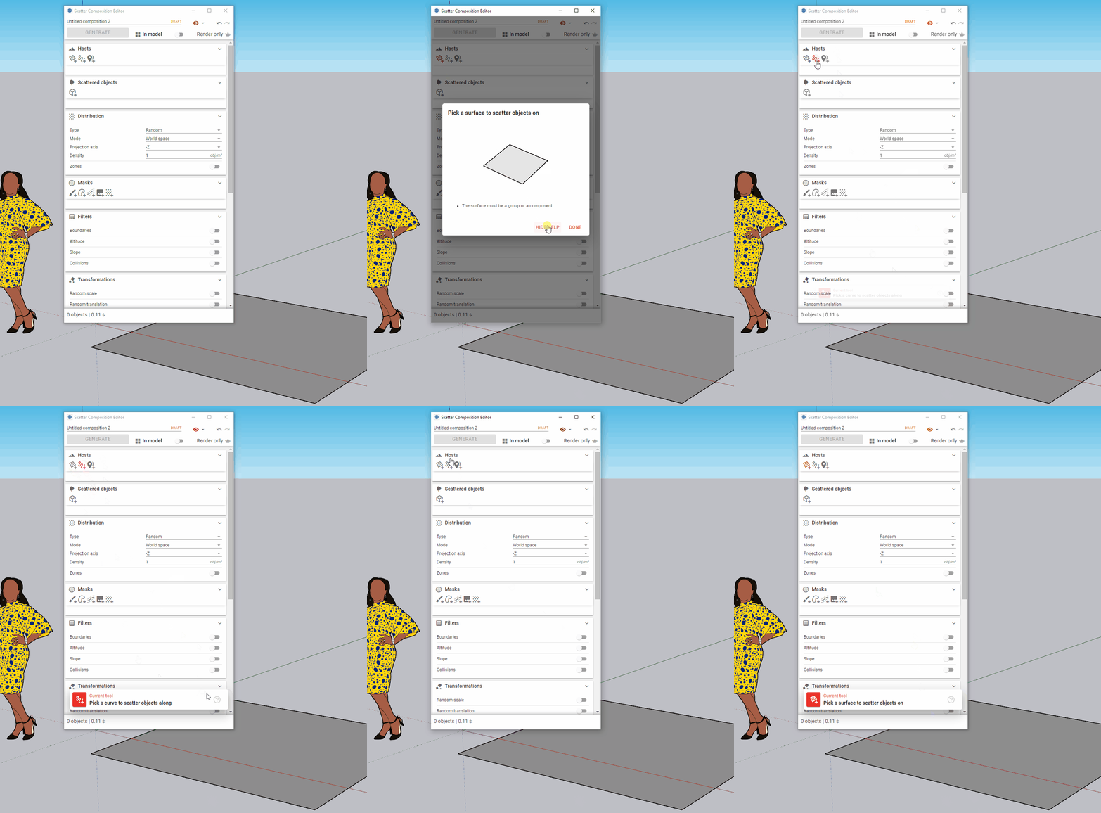
That’s noted. We also had another request in another thread for the ability to copy paint masks.
So we’re going to discuss internally if we should consider more ways to copy/paste/merge entities in the future.
I’m not sure I understand. The preview should always show the instances (red lines). Do you also want the blue points to be always visible in the preview?
Not quite, but I’ll try to be more explicit.
When opening the skatter composition, all instances are visible, with different colors (another great improvement by the way). No need to have permanently the blue points displayed in my opinion.
However, when there are different point sets, a list is generated where they can be renamed by clicking on the title. That’s when you select one on the list that the blue points could be visible to visualize which instances belong to which point set. For now, you can only see it when clicking + or - button. When you have several point sets, it just adds more clicks.
Hope it’s clearer
This is needed to prevent the component definitions of objects disappearing from the model when it’s purged. By keeping them in a hidden group, we ensure that they are never deleted (several users reported this issue, and Skatter 1 already did that).
However, this group should (1) only exist for Render Only compositions and (2) be hidden and locked. Does it still happen with the latest version? (2.0.3)
Thanks for the details about the point sets! I added it to our request list.
Hi,
Sorry for the delay. It happened only in that specific model I was working on (now it’s rendered and delivered ).
I tried on an empty model to check but couldn’t reproduce it…
@merwan hey Merwan,
I’m a rhino user and skatter plugin is pushing me to use sketchup! I hope you can Integrate rhino plugin or tell me the best workflow to back-and-forth between rhino and sketchup as I only need to use skatter for my context
We have plans to integrate Skatter into other platforms but it will take a bit of time and unfortunately Rhino is not at the top of our priority list for now.
I guess that the most basic workflow would be to model in Rhino and then import the result into SketchUp to scatter stuff and finish up your project but that really depends on your use case.
I have no experience with Rhino myself but maybe other users could chime in?